 Vanity barcodes have grown popular over years because they are a innovative source of branding. Designers sometimes believe they can transform a ubiquitous UPC barcode into something unique and creative that will distinguish their brand from all others. Just remember the distinction should result in a positive, not a negative.
Whereas as a logo and brand style might entice a consumer to purchase a product, if the barcode on that product cannot be scanned at the cash register, the inventory will not properly be deducted the retailer will not know to place a reorder. Investing in a non-scannable vanity barcode is useless and will mostly have a negative impact on your brand, sales and potentially adverse retailer relations.
Basic Fundamentals for Vanity Barcodes
The GS1 General Specifications are the global guidelines for UPC barcode symbols and provide the minimum sizing and print quality requirements. The POS scanners in stores are configured to meet these minimum requirements so it is imperative that all barcodes, vanity or not, adhere to these compliance guidelines. Designs that reduce the barcode symbol (aka truncate) below the height minimum, split the bars, and/or have spaces that interrupt the scan path needed for a scanner to decode the data are completely ineffective.
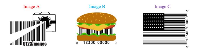
Image A – Split bars issue; the bars are split by the flash design stretching across the barcode and the company name at the bottom right corner.
Image B – Truncation issue; the shortest bars do not meet the height requirement.
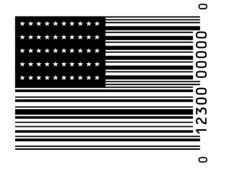
Image C – Satisfies the height and width requirements and no interruptions in the scan path.
In addition to size and shape, a UPC barcode must have adequate quiet zones to ensure it will scan properly. Quiet zone is designated space which precedes the start character of a barcode field and follows the stop character. Simply put, quiet zone is space on the left and right side of the bar code free of any printing. Quiet zone may also be referred to as free space or clear area.
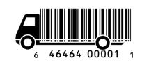 The barcode shown to the left does not have the adequate quiet zone. The space from the start character on the left of the barcode to the start of the design does not merit enough free space for scanning.
Step One – Always Begin with a Precise Digital Image
All digital barcode artwork should be created as a vector image to maximize the resolution of the barcode symbol and minimize file size. The most common file format used is .EPS and .EMF (for MicroSoft software). To learn more about digital barcode file formats, please visit https://www.barcode.graphics/vector-barcodes/.
Another very important rule is that digital barcodes should NEVER be resized from the original file. Unfortunately, due to the ease of making alterations by simply dragging a corner of an image, many barcode symbols loose their dimensional accuracy when resized.
Caution When Using Colors
A barcode symbol does not always need to be printed in black over a white background. Traditional barcode scanners work off of reflectance values and acceptable color combinations need a high contrast in low reflectance bars printed on high reflectance backgrounds. For example, blue on white or black on yellow are acceptable scannable color combinations. However, a combination like red on white does not allow enough contrast. To view a list of scannable color combinations review our color guide available here https://www.barcode.graphics/upc-color-guide/.

Other Factors Which Impact Barcode Compliance
It may seem trivial and unbecoming to your design, but the human readable text should always be included. The human readable text can be helpful if there are any instances when the barcode is unscannable. When the human readable interpretation is included, the end user always has an idea of what the encoded data should be and the product can still be identified.
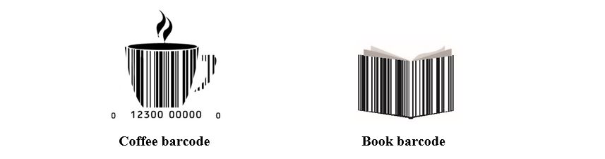
In the picture examples above, the “Coffee” barcode has identifiable UPC data whereas the “book” barcode does not. If the “Coffee” barcode cannot be scanned, the data “012300000000” can be typed into the POS to identify the product. If the “Book” barcode cannot be scanned, the item cannot be identified because there is no human readable data either above or below the barcode.
At Bar Code Graphics, we are somewhat biased and think properly printed barcode symbols look amazing. In order to insure creative barcodes will meet the minimum requirements, we recommend companies submit print proofs for evaluation to our testing division, Identification Labs. It is alright to want to embrace a little creativity but it is imperative that the barcode symbol perform in the marked. It facilitates a better user experience when the barcode scans the firs time and also insures that stores will quickly reorder your product when they capture sales.
To submit a sample for testing, please visit https://www.barcode.graphics/identification-labs-certification/ or contact us at 800-662-0701 x250.
If you have some bad barcode examples, email them to us at sales@barcode.graphics or post and tag us on twitter @BarcodesGoneBad.


Comments are closed.